Identity and Applied Graphics for Permoria
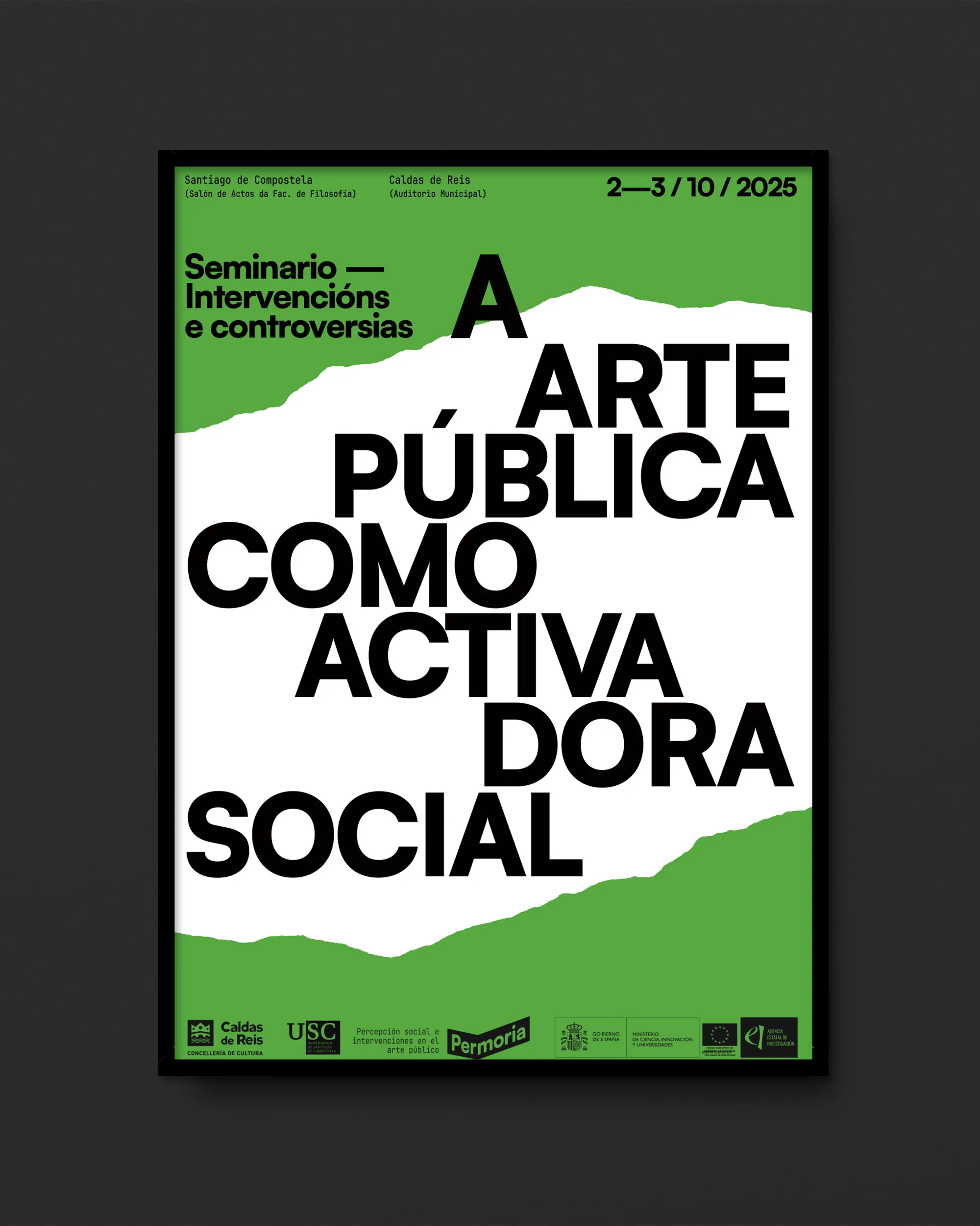
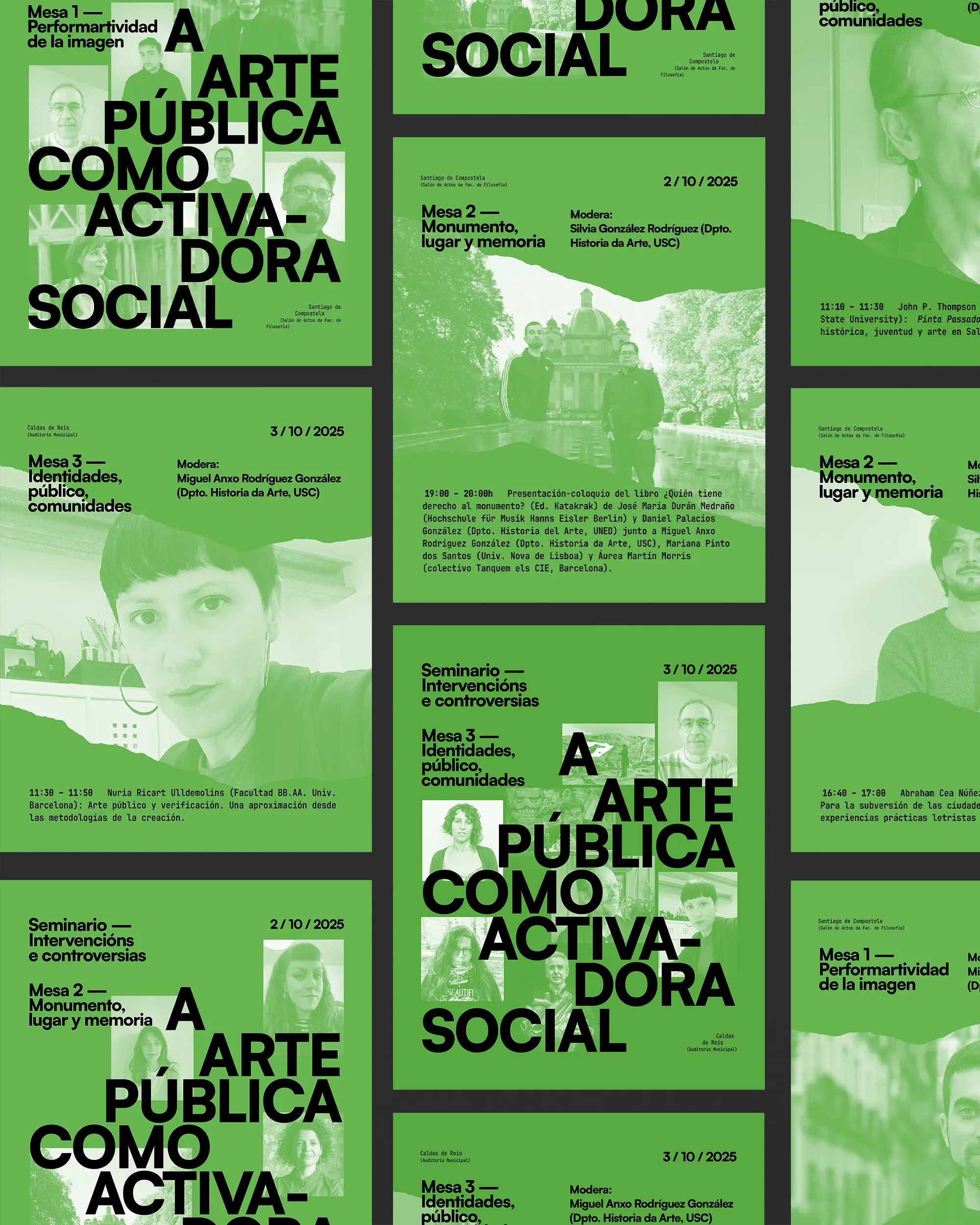
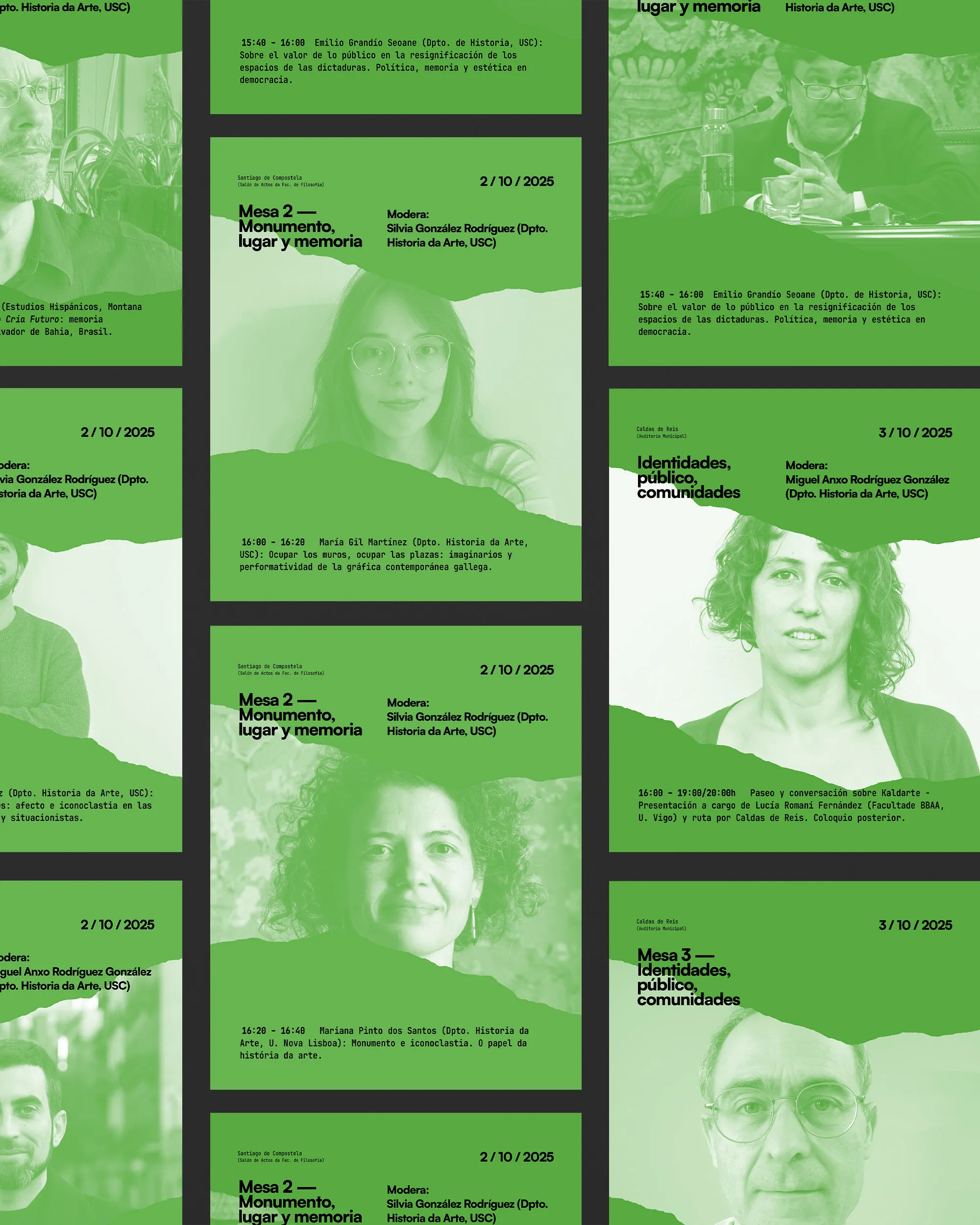
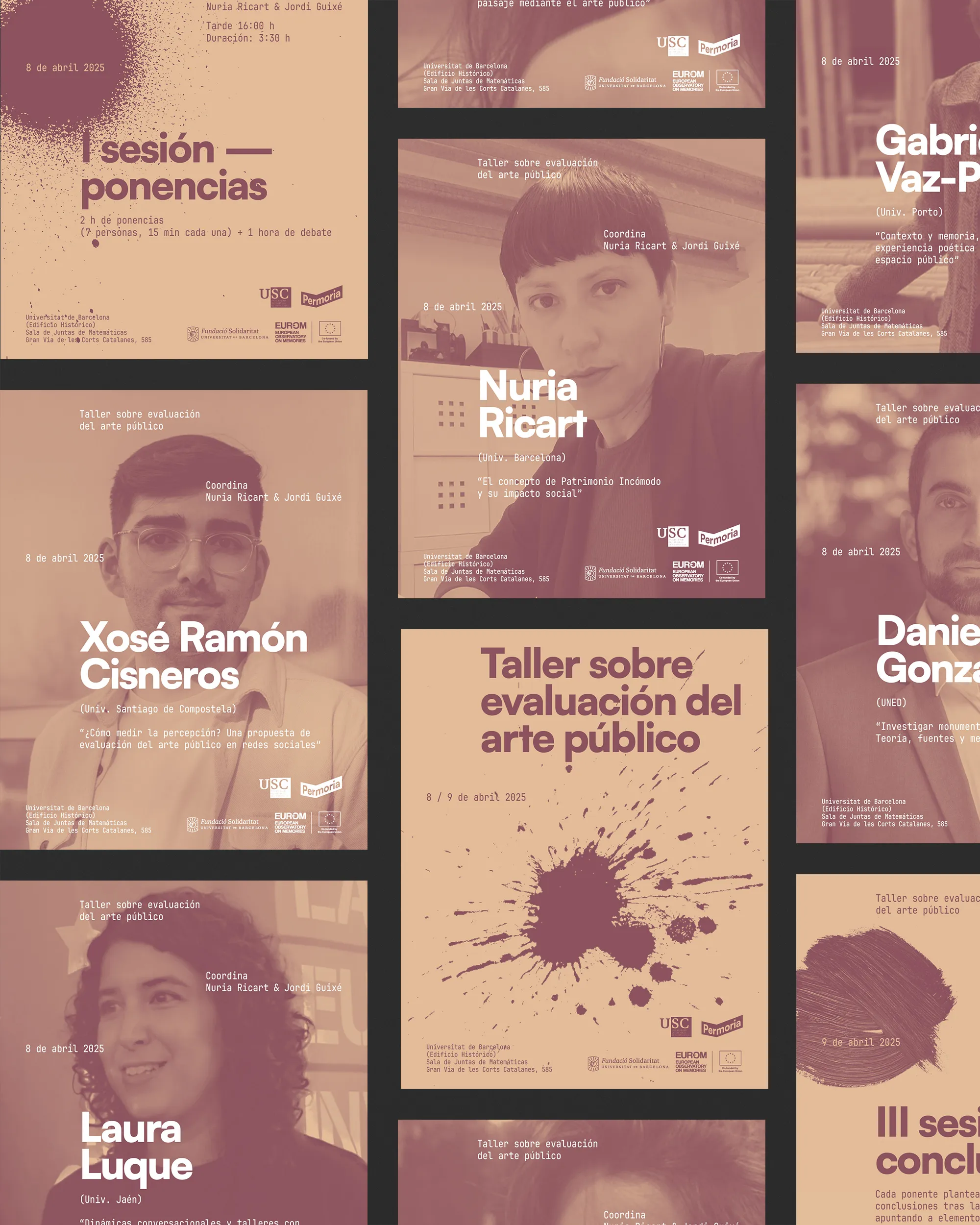
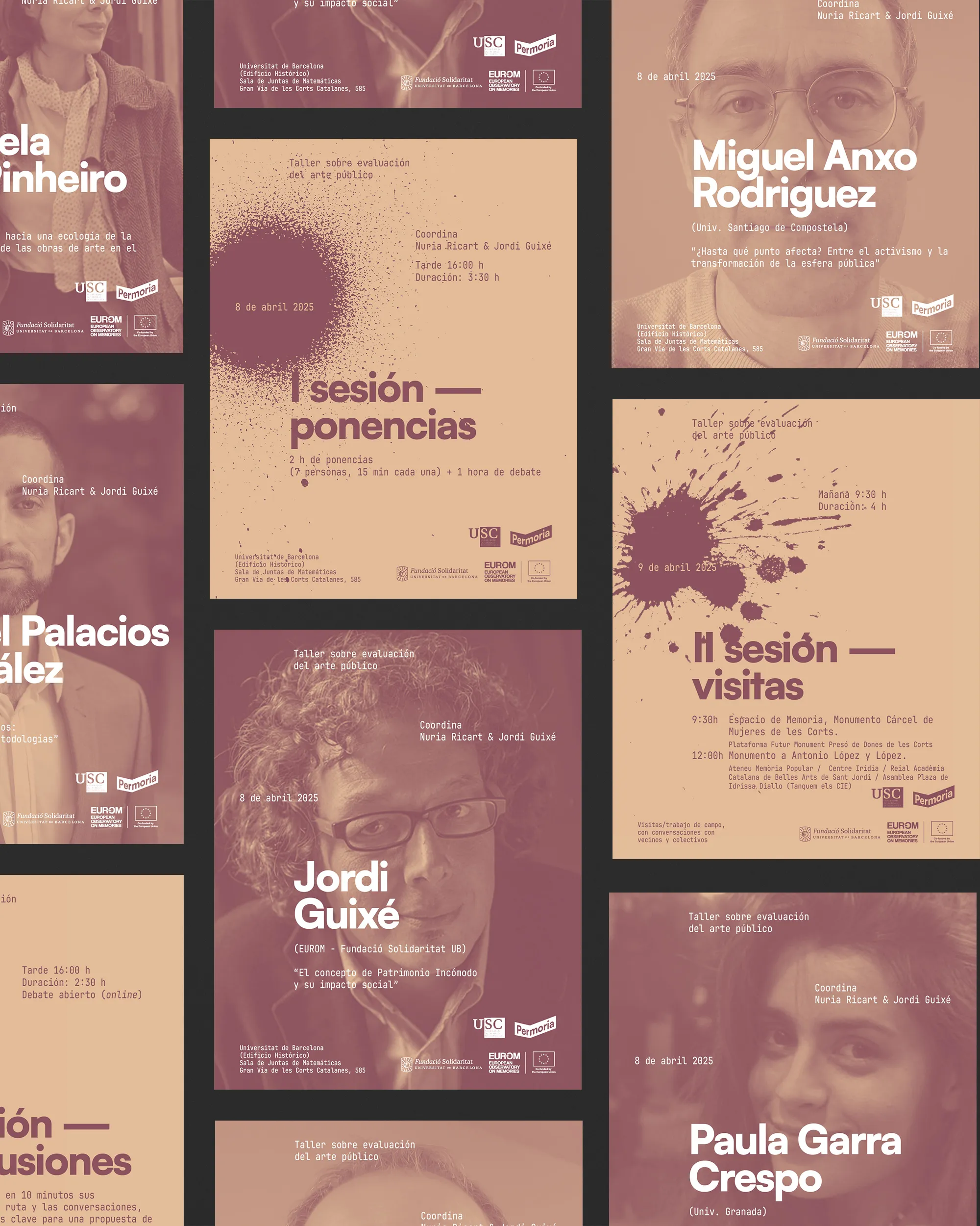
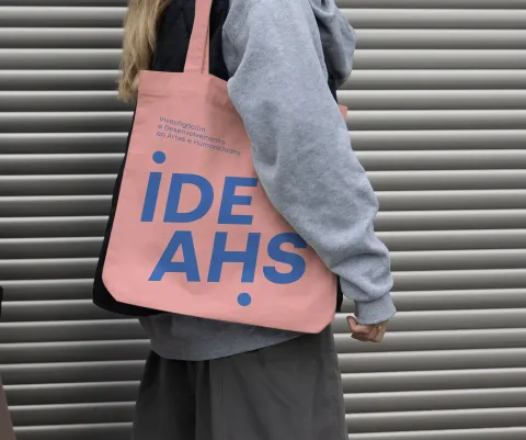
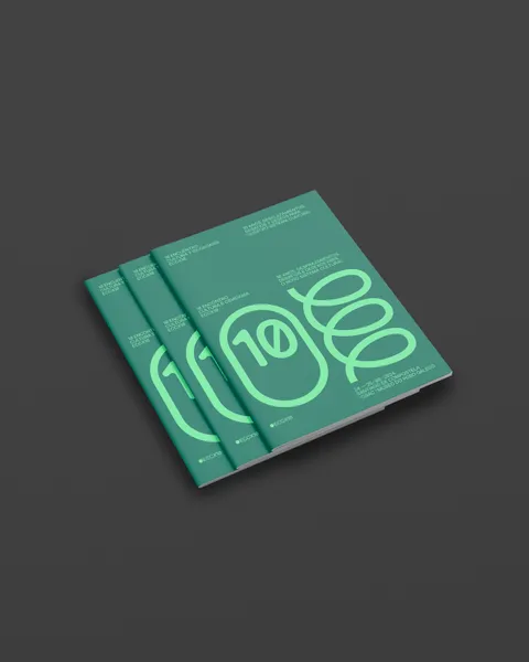
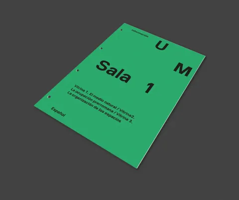
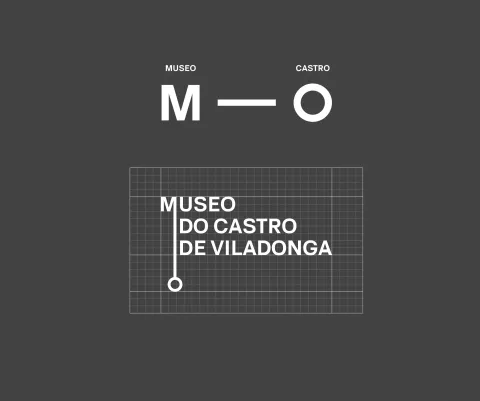
The identity of Permoria is built on the concept of space, materialized in a logo conceived as a rectangular prism from which two faces are preserved that act as an active support for the name.
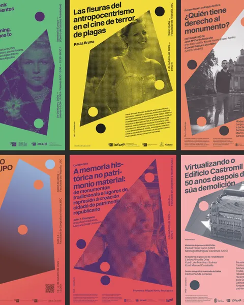
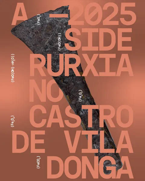
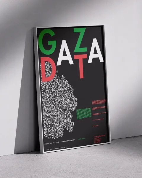
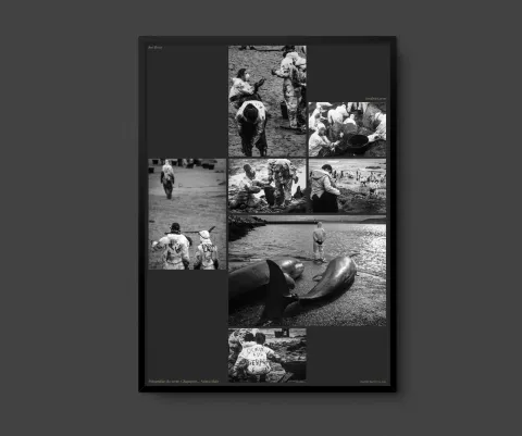
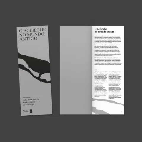
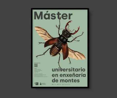
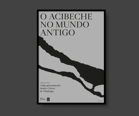
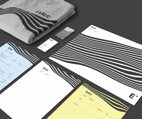
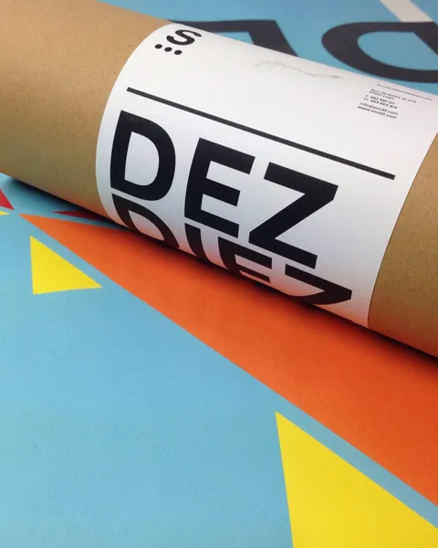
The graphics are not limited to representing, but to intervening in the format itself, in the same way that the project intervenes in space: broken leaves, stains, spray or scratches refer to direct action on the territory and its languages.
Space and intervention merge into the same idea: the support ceases to be neutral to become a place of action.